The long spirally road of web development

So I haven’t posted many updates recently and the reason mainly has been there hasn’t been much to post. The last couple of weeks have consisted of trying to find the right tools to tackle the task at hand. I have experimented with quite a few different methods and softwares to try and get the parallax scrolling to work in a way that works for us.

This includes:

  • Using CSS alone to create a parallax effect <— http://keithclark.co.uk/articles/pure-css-parallax-websites/
  • Using a standalone parallax scrolling Javascript library <— e.g. Scrollr.
  • Adobe Dreamweaver
  • Adobe Edge Animate
  • Brackets
  • Adobe Muse <— What I decided on.

The only software I have previously used to develop websites on has been Dreamweaver. I experimented this time with using Brackets, which has the great feature of extracting CSS from a PSD file. This let me easily format all the elements on the page very quickly. I also far prefer the layout, finding it much simpler and more straightforward than Dreamweaver. However, I had a lot of trouble getting to grips with Parallax this way. I just found the process too complicated and fiddly to achieve the effect I wanted. This prompted me to search for software that would do some of the heavy lifting, leaving me to focus on the visual aspects of the site.

I experimented with Edge Animate, using the ‘EdgeCommons’ Javascript library to link the timeline to the user scrolling. Whilst this did work, it made it hard to synchronise the scrolling on different device widths. As I was working on solving this problem, I stumbled upon this video which I found very helpful.

This led me to experiment with Muse which I had never previously used. It was exactly what I had been looking for. It made the whole process of parallax far easier to achieve, letting me concentrate on other aspects of the site.

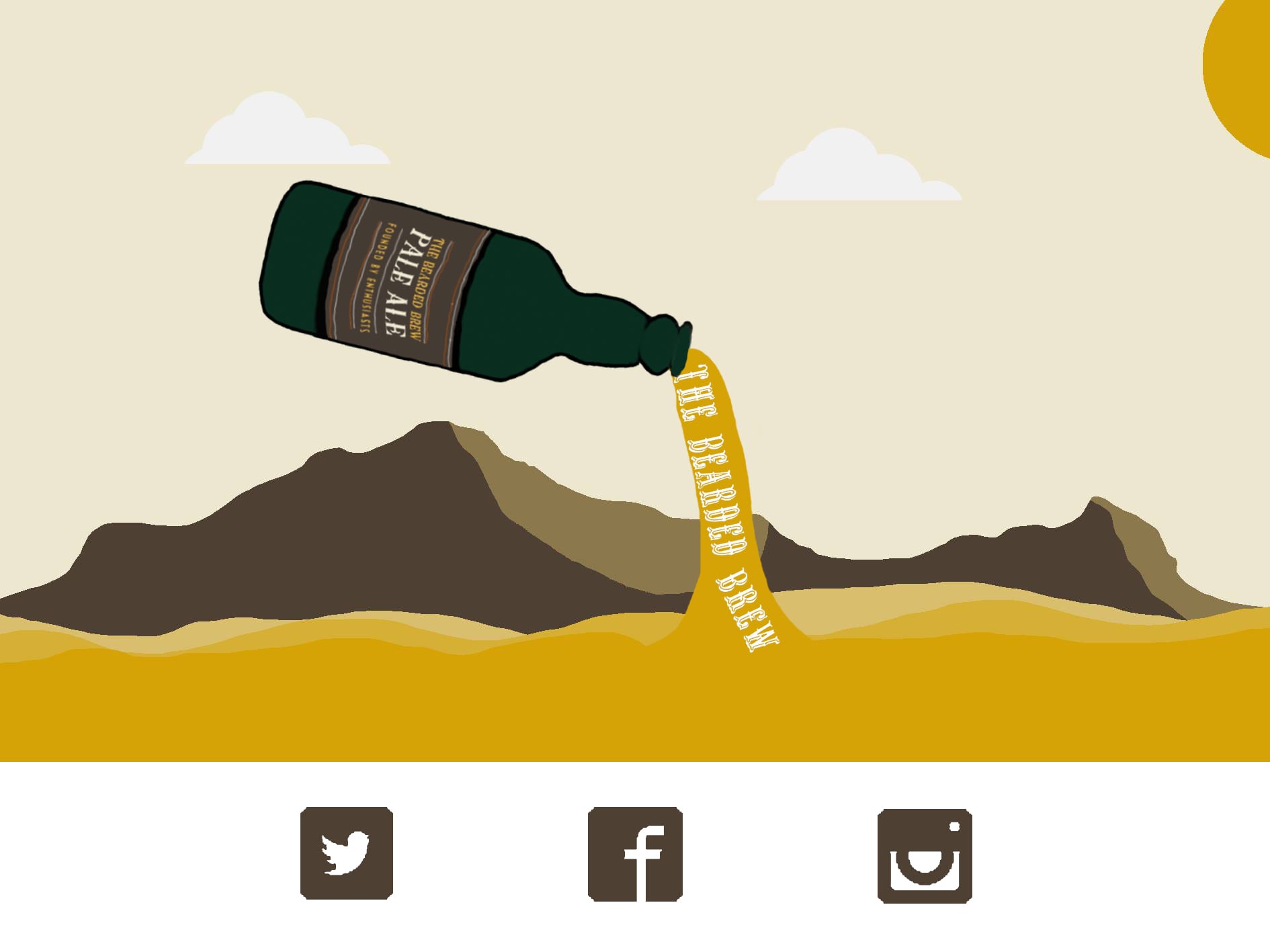
Here is my update on what the main page of the site currently looks like:

Whilst it still needs to be populated with content, I think the layout of it and design is nearly there.


What i’ve learned from all this experimenting is that I shouldn’t be afraid of new tools. If I had just stuck with Dreamweaver I don’t think the site would be anywhere near this stage. And whilst I understand that with Dreamweaver and Brackets you have far more power and control over your final site, if another tool offers everything that you want and is simpler, why shouldn’t you use it?


No beer now, only work.


– Alex

Final Flyer Design

After spending some time discussing the design of the original flyer, Alex and I decided to run it by James and see what he thought.  He gave us great feedback of some elements that needed minor changes and after following through with these, we have our finished flyer…

Flyer Complete


We altered the arrangement of some of the text and changed the opacity of the orange assets to 70% as the contrast was quite high.  We also changed the date, as I originally entered the wrong one!! However, the flyers have been sent to the printer and will be ready to dispatch around Lincoln tomorrow. Time to introduce the Facebook event page…


– Alice

Now lets justify parallax…

Parallax scrolling has become a very popular technique recently and it appears to be popping up everywhere.  It seems to be one of those design elements that can either be done incredibly well, or incredibly poorly, and obviously Alex and I want our use of it, to come under the category of ‘incredibly well’.


Our reasons for choosing to go down this route are simple and minimal.  We wanted to create a website that encouraged users to want to revisit, something that would generate a ‘regular’ customer, who wants to buy a more than regular product. You’ll be more than likely to revisit a website if not only the product was worth purchasing, but the experience in purchasing it was just as good, right? That is our intention.


Parallax is capable of many things, it just depends on what you decide to do with it.  We want a website that is easy and enjoyable to navigate, smooth and consistent.  We believe introducing parallax to our designs will enable them the full ability to do what they were intended, and that is to engage an audience.


We aren’t using parallax, because it’s a common trend and we want to keep up.  We are using it because it fits.  The Bearded Brew has it’s own personality already, one we believe to be distinguished in it’s approach to encouraging simplicity and enjoyment. And that is our justification.


Parallax; you may be used and abused throughout the web-design industry, but you are effective when used appropriately…and we are using you appropriately.


– Alice + Alex


Marketing Ideas

Hola,


This morning Alex and I spent some time designing the flyers for the event we intend to hold, early December.  We are still waiting on our preferred venue to get back in touch with us so we can confirm a date and time, however the picture below shows what the flyers will look like, just without the specifics.


Flyer Design


This flyer was created on InDesign, as we mentioned at the beginning of this project that we wanted to incorporate as many different skills as possible.  So instead of using Photoshop, we decided to venture out a little and work with a different programme, one we aren’t completely familiar with. As you can see by the flyer, we are keeping a consistent design throughout the build of this project.  We have also had some problems with finding the original font used on Luke’s original designs, and so today we finally decided upon ‘Copperplate Light’ to use as our primary font.


After spending some time putting this design together, we started thinking about different ways to advertise the event, without sticking to a standard flyer procedure.  We had ideas to hand out beer coasters or solo cups instead, however after researching this further, it was unfortunately out of our price range.  We won’t entirely write off this idea completely, as it could be useful for the bearded brew future.


Once we know all the details of the event, we will complete the design and upload a finished version.


– Alice


Playing with Photoshop

Hola,


This morning I have spent some time designing ideas for the potential look of our website.  We know what style we want to go with and we have the majority of our design elements ready, we just don’t know how we want it to look.  We both feel it is important to play around with a range of ideas in order to allow our thought process to select a particular style that we want to follow through with.  Below are a couple of stills that show some basic design techniques. We are proceeding with the ambition to create a  parallax scrolling website, however I can’t show the movement process through Word Press.


Idea 1:

Web Mock Up


Idea 2:

Mock up 3


There will be more ideas to come, these are just two that I quickly came up with.  I prefer the first, however I wanted to see what it would look like if I played around with an animated drawing of the beer itself. I would like to incorporate the drawing of the bottle at some point throughout the webpage, maybe have it at the very beginning, pouring out the ale (and the words that will hopefully be narrated). To do this particular style of animation on the webpage we will have to work with Javascript, however the idea is still under construction :).


Thanks!


– Alice